

Overview
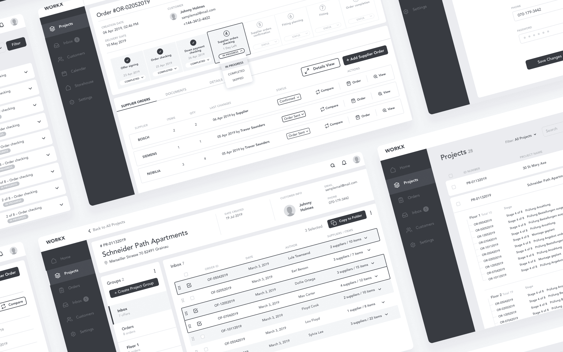
WORKX is a cloud-based Enterprise Resource Planning (ERP) system purpose-built to digitize and optimize the end-to-end order management lifecycle within the German furniture industry. Designed specifically for kitchen and furniture retailers, manufacturers and logistics providers, the platform consolidates fragmented workflows by centralizing order processing, inventory management, and inter-organizational communication. WORKX integrates seamlessly with existing CAD and planning tools, while its modular cloud architecture reduces infrastructure overhead, automates routine tasks, and ensures scalability across distributed operations.
My Role
Full-stack product design across UX, UI & Systems
Client, Date, Duration
RMTsoft GmbH, 24 months (2021–2023)
Tools
Miro
Figma
Maze


Meet the people behind the problem
To design a solution that truly fits, I mapped out four core personas representing the main user roles within WorkX. Each persona faces distinct challenges, goals, and emotional responses — from operational inefficiencies to communication breakdowns. These Empathy Maps helped frame not just what users do, but what they feel, need, and struggle with — forming the emotional foundation of the product strategy.
Mapping user journeys to uncover where things break — and why.
To design a system that truly supports users, I started by mapping how work actually flows. This meant stepping into the shoes of each role in the WorkX platform — from first client touch to final delivery. The journey maps exposed key friction points, tool-hopping, and lost context — the invisible blockers behind missed deadlines and team misalignment.
Shown here: the Sales Manager’s journey. A clear look at where breakdowns happen, and how thoughtful UX can turn chaos into clarity.


Structured Navigation for Scalable User Experience
The information architecture of WorkX was intentionally designed for clarity, scalability, and reduced cognitive load. As a Senior UX Designer, I focused on building a logical and predictable structure that supports the daily workflows of various roles — from project managers to procurement specialists. Clear segmentation, consistent page layouts, and prioritizations of key content enable users to navigate intuitively and accomplish tasks efficiently, regardless of their digital fluency. This structure becomes even more critical as the platform scales, ensuring long-term flexibility and system resilience.

High-fidelity thinking at low-fidelity stages
Designing WORKX from the ground up required building a strong conceptual foundation. I began with rapid sketching to explore ideas quickly and visually align with user and business needs. These evolved into detailed wireframes, which — while technically low-fidelity — were intentionally high in functional precision.
This approach allowed us to simulate real user flows early on and run usability testing before any visual design was applied. It helped validate navigation patterns, page logic, and core interactions while staying agile.
The benefit: quick iteration with real feedback, faster stakeholder alignment, and early detection of UX issues.
The trade-off: detailed wireframes can be time-consuming and may blur boundaries between UX and UI — requiring clear communication within the team to avoid confusion.
Visual Identity: Designing with Clarity, Confidence, and Character
As the sole Product Designer on the WorkX project, I created the entire visual identity from the ground up — including the logo, brand mark (check symbol), favicon, and comprehensive style guide. The logo centers around a custom-designed checkmark embedded in the “X”, symbolizing successfully completed processes — a direct nod to WorkX’s purpose: streamlining and digitizing the complex workflows of order management in the furniture industry.
The vibrant orange background reflects the platform’s energy, momentum, and human-centered approach, setting it apart from typical ERP tools that often lean toward neutral or impersonal tones. Orange also supports rapid visual recognition and evokes optimism and clarity — key emotional cues in a system designed to reduce friction and improve collaboration between manufacturers, retailers, and logistics teams.
Paired with the modern, geometric Manrope typeface, the visual system reinforces the brand’s core attributes: precision, accessibility, and scalability. Together, these elements communicate not just aesthetics, but purpose — ensuring that every visual component reinforces WorkX’s identity as a powerful, intuitive tool built for the real operational challenges of the furniture supply chain.


To ensure design consistency at scale, I also introduced a Design Token system early in the process. These tokens defined the foundational elements of the UI — including color values, typography, spacing, radii, and shadow levels — and served as a single source of truth across design and development. By standardizing these variables, the token system enabled faster prototyping, easier theming, and seamless handoff to engineers. It also laid the groundwork for future scalability, allowing the WorkX design language to remain flexible yet structured as new modules and features are added.
